Kia is a South Korean automobile manufacturing corporation that was founded in 1944 and was the one to produce first Korea’s bicycle in 1951s Today Kia is one of the largest car manufacturers in Asia, which distributes its vehicles across the globe.
Meaning and History
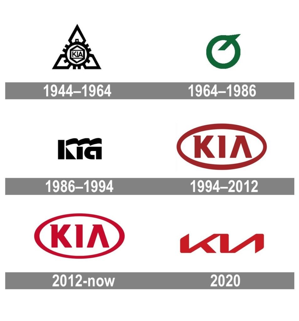
The first KIA logo was designed when the company was focused on the manufacturing of bicycles. It was composed of a three diamonds pattern with a gear in the middle. The company’s name was placed inside the gear and framed on another diamond. It was complicated and strong work for its time. The monochrome palette added a sense of professionalism and authority.
The only thing that remained untouched in the KIA logo is the presence of the wordmark, but the style and the typeface varied from one redesign to another.
1944 – 1964
The first KIA logo was designed when the company was focused on the manufacturing of bicycles. It was composed of a three diamonds pattern with a gear in the middle. The company’s name was placed inside the gear and framed on another diamond. It was complicated and strong work for its time. The monochrome palette added a sense of professionalism and authority.
1964 – 1986
In the 1960s the company’s profile changed and KIA started manufacturing licensed cars. The new logo featured a green circle with a diagonal line coming out of it and looking upwards and right. The emblem resembles an upside-down letter Q.
1986 – 1994
In the 1980s the KIA logo was composed of a stylized wordmark, executed in thick bold lettering of a custom typeface, with a curve line, replacing the upper bar of the letter “K”.
1994 – 2012
In the 1990s the base of the current KIA logo was designed. A horizontally located oval with a wordmark inside. The red and white is the official color palette of the brand new, where the red represents the company’s passion and energy and white stands for purity and loyalty
The custom typeface of a wordmark is simple and clear, and the only unique element of the lettering is the absence of the horizontal bar in the letter “A”.
2012 – Now
The previous emblem was only slightly refined by today. The lines became more bold and clear, the colors — brighter.
The KIA logo is an example of minimalist and laconic design, which is stylish and timeless. It has no extras, but the essence of the brand is readable.
2020 – Today
The redesign of 2020 brings a young and futuristic style to the KIA visual identity, by minimizing the elements on the badge, yet keeping the uniqueness and recognizability of the brand.
The new logo is composed of a stylized red inscription, where all three letters are connected with each other, “K” merged with “I” in the top point, and “I” with “A” — in the bottom, and this makes the wordmark look like two Cyrillic letters “КИ”
The nameplate looks like it has been enlarged and now does not fit in the screen in its whole size. The upper left and bottom right corners are diagonally cut.
The Korean Logo
The most interesting thing about KIA’s visual identity is that the brand has different logos for international and Korean markets.
The logo used in the brand’s homeland is completely different. It is composed of a blue circle with a thick black outline the KIA symbol inside the circle and the wordmark around its perimeter.
The symbol is a stylized image of the letter “K”, drawn in elegant white lines. It is a sophisticated and bright emblem, which is completely different from the logo we all used to see.
The Emblem
The KIA emblem uses silver metal when placed in the cars. The silver color adds volume and makes it look more sleek and vivid. The KIA emblem looks good and light due to the simplicity of its shape and lines. It is easily complimented with any typeface of the car model name, which is usually placed on the right of the emblem.

